Leaning into the future: how we redesigned the identity of Pisa Sporting Club
A soccer club with 116 years of history, a city recognized around the world, and a return to Serie A after 34 years. The Pisa SC rebrand captures our approach to brand strategy: research first, design second.
6 min read

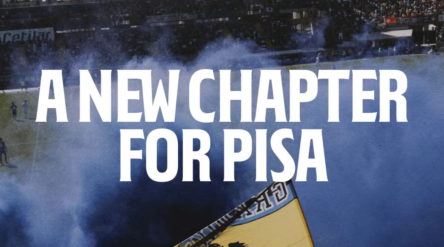
On May 4, 2025, Pisa Sporting Club earned promotion to Serie A after a 34-year wait. It was a turning point, and it raised a question that went far beyond the field: how does a club present itself to the world after three decades away from the international stage, without betraying the identity its fans protected through all those difficult years?
That question was the starting point of the rebranding project we developed with the club, unveiled in July 2025 and covered by the design and sports press as one of the most interesting identity projects in recent Italian soccer.
The challenge: from club to media brand
Soccer today is far more than a sport that gathers fans in a stadium once a week. It's a global subculture connecting millions of people every day through content, merchandising, and digital platforms. Fans no longer want to just watch: they want to participate, engage, and belong.
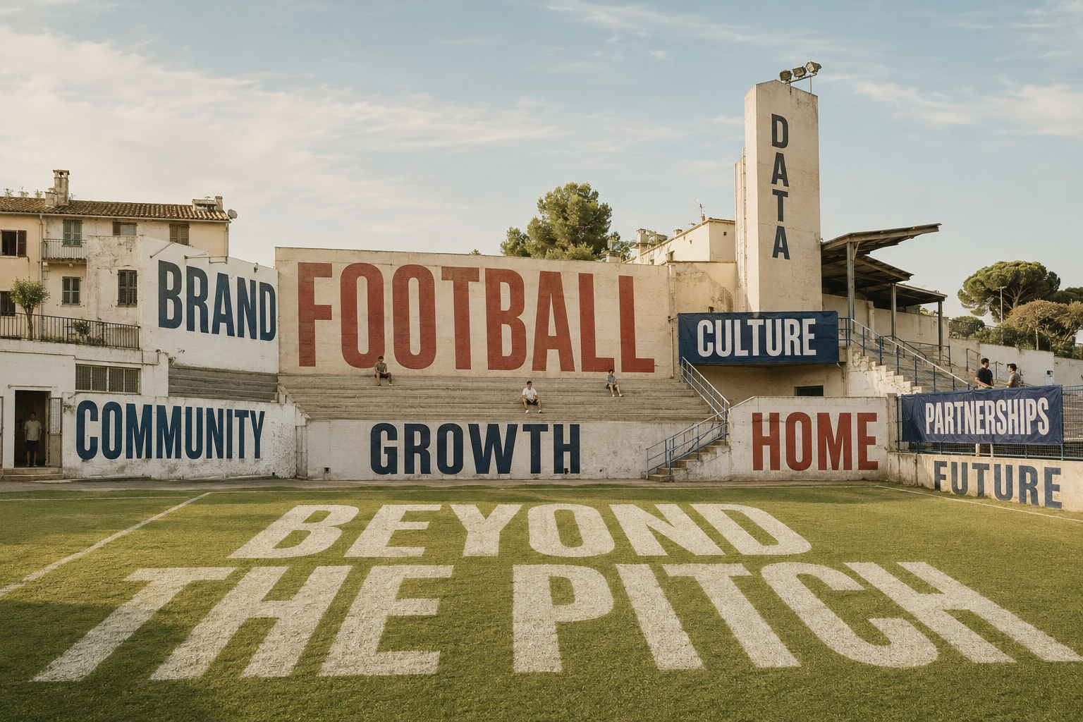
That's why the goal we set together with the club was never "design a new logo." It was to reposition Pisa SC as a proud, distinctive club with deep local roots and growing international ambition, and to equip it with a brand system that is clear, flexible, and recognizable, built to perform across every platform and format: a true contemporary media brand.
The method: research before design
The project began far away from any design software. We explored the city and the club along eight research tracks: the city itself, its architecture, culture, iconography, history, the Arena Garibaldi, the fan community, and the club. Photographing storefront signs, sidewalks, medieval coins, ceramic tiles, banners, and flags, we assembled a visual heritage that was fragmented yet remarkably coherent.
From that immersion emerged the traits that define the Pisan soul: a spirit that is passionate, proud, unconventional, and combative; self-irony, the ability to take an insult and wear it with pride; resilience, that stubborn, inventive cleverness in the face of complicated situations; the sense of belonging embodied by the Pisan cross; and the eclecticism of an architectural style born from a blend of cultural influences.
All of it came together in the brand platform: Leaning into the future. Like its Tower, Pisa knows what it means to lean without falling. Now it leans toward the future.
"Defying gravity," the claim beneath the claim
If "Leaning into the future" is the brand's public promise, "Defying gravity" is the force that makes it credible. The two work as a pair: one projects, the other resists.
"Defying gravity" is the most authentic expression of the Pisan spirit: an obstinate, quiet force that holds on, endures, and never surrenders. Just as the Tower defies the laws of physics, Pisa and its people have faced obstacles, setbacks, and transformations without ever ceasing to believe in themselves. Thirty-four years outside Serie A would have eroded most fan bases; in Pisa, that loyalty never wavered, not out of nostalgia, but out of a deep connection between the club, the people, and their city.
As a claim, it does three things a tagline rarely manages at once. It's rooted in a physical, universally recognized truth (the world's most famous "mistake" that became a wonder), so it needs no explanation in any language. It reframes a perceived weakness as the brand's core strength, which is the essence of Pisan self-irony. And it works as an internal compass as much as an external message: it tells fans "this is who we've always been" while telling the world "this is why we won't fall." Where "Leaning into the future" sets the direction, "Defying gravity" supplies the proof.
The elements: cross, typeface, color
Three icons guide the identity: the Cross, the symbol of belonging for the people of Pisa; the Tower, the identity symbol of the city; and 1909, the founding year, the symbol of the club's heritage.
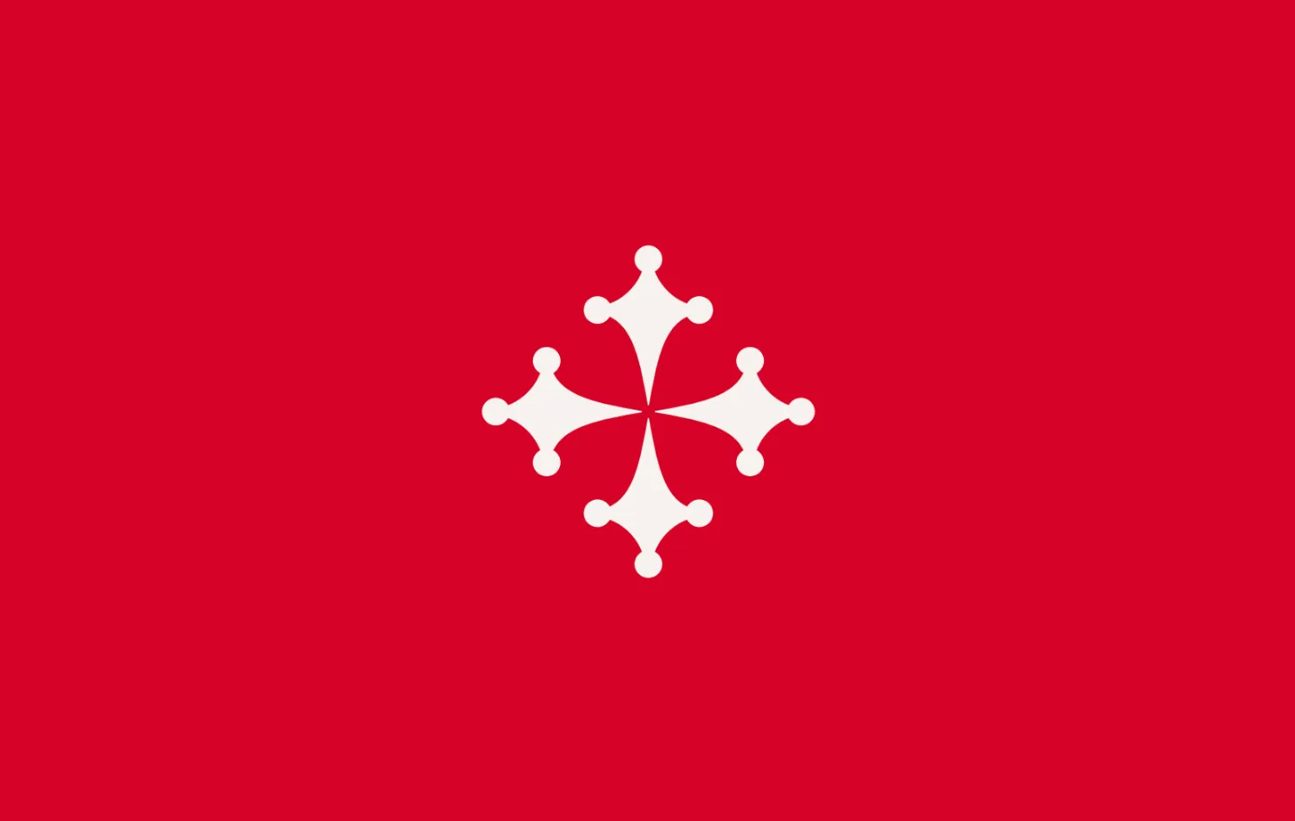
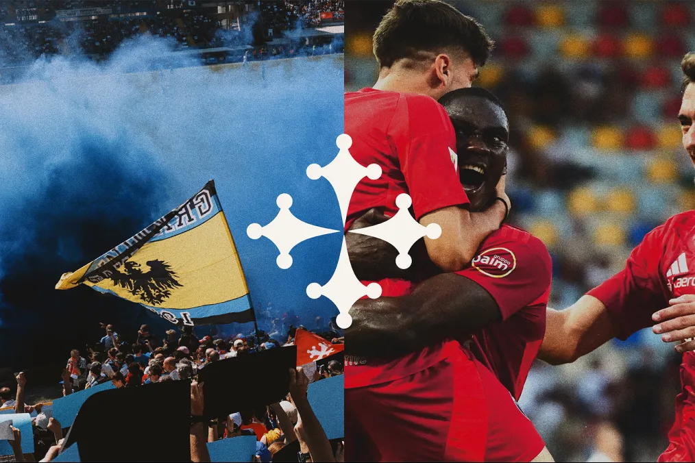
The Cross of Pisa. There is no single Pisan cross: dozens of versions coexist across the city, with styles and proportions that vary by era and context. Rather than picking one, we collected, studied, and harmonized this fragmented heritage into a single graphic mark: a new cross, still deeply Pisan, that gathers the many souls of the city and becomes the active symbol of the brand.

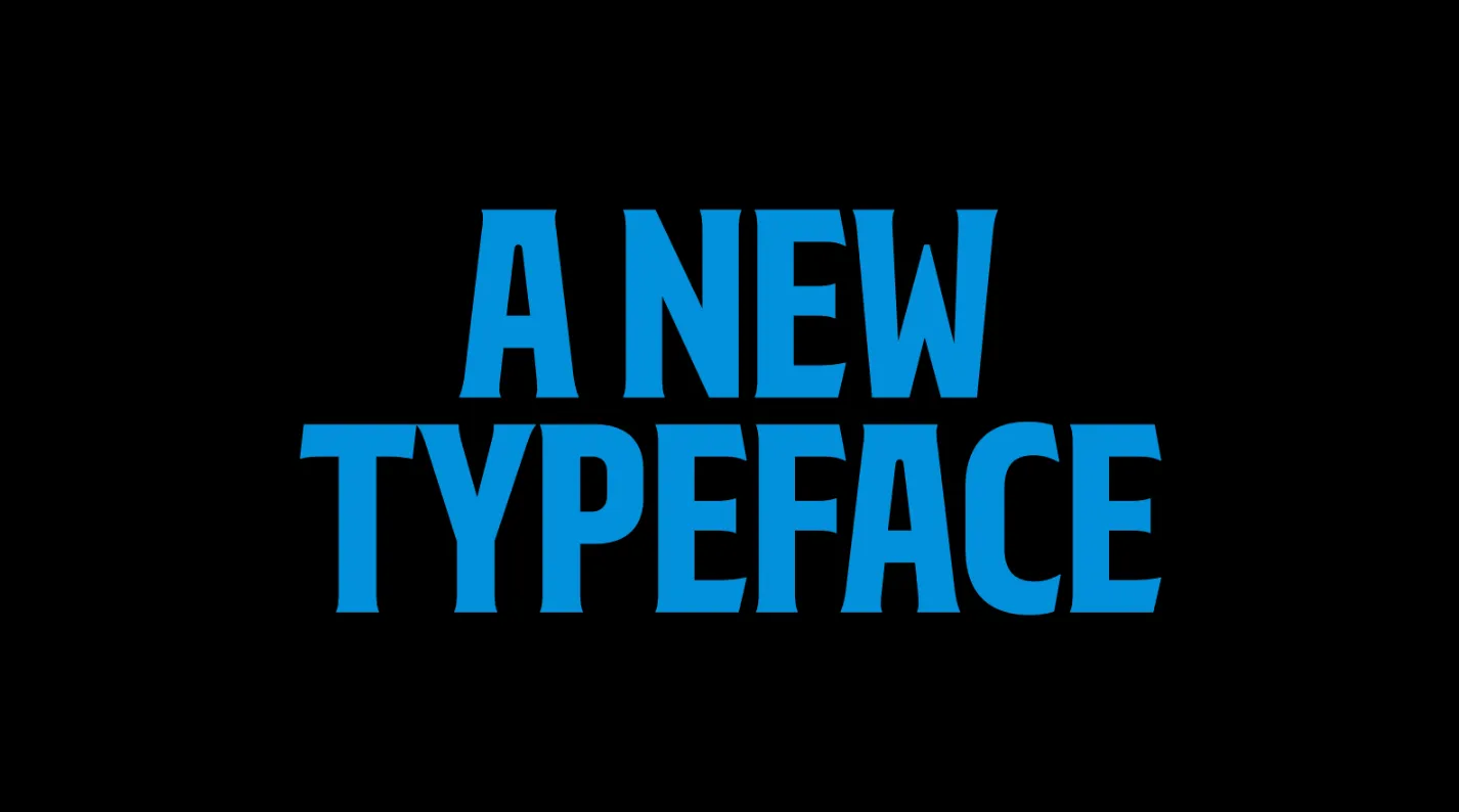
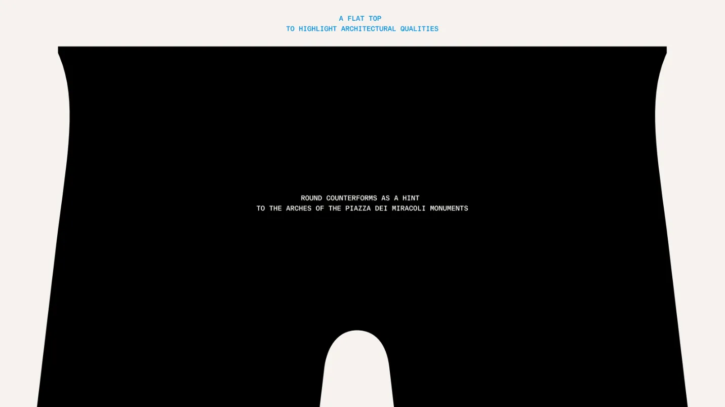
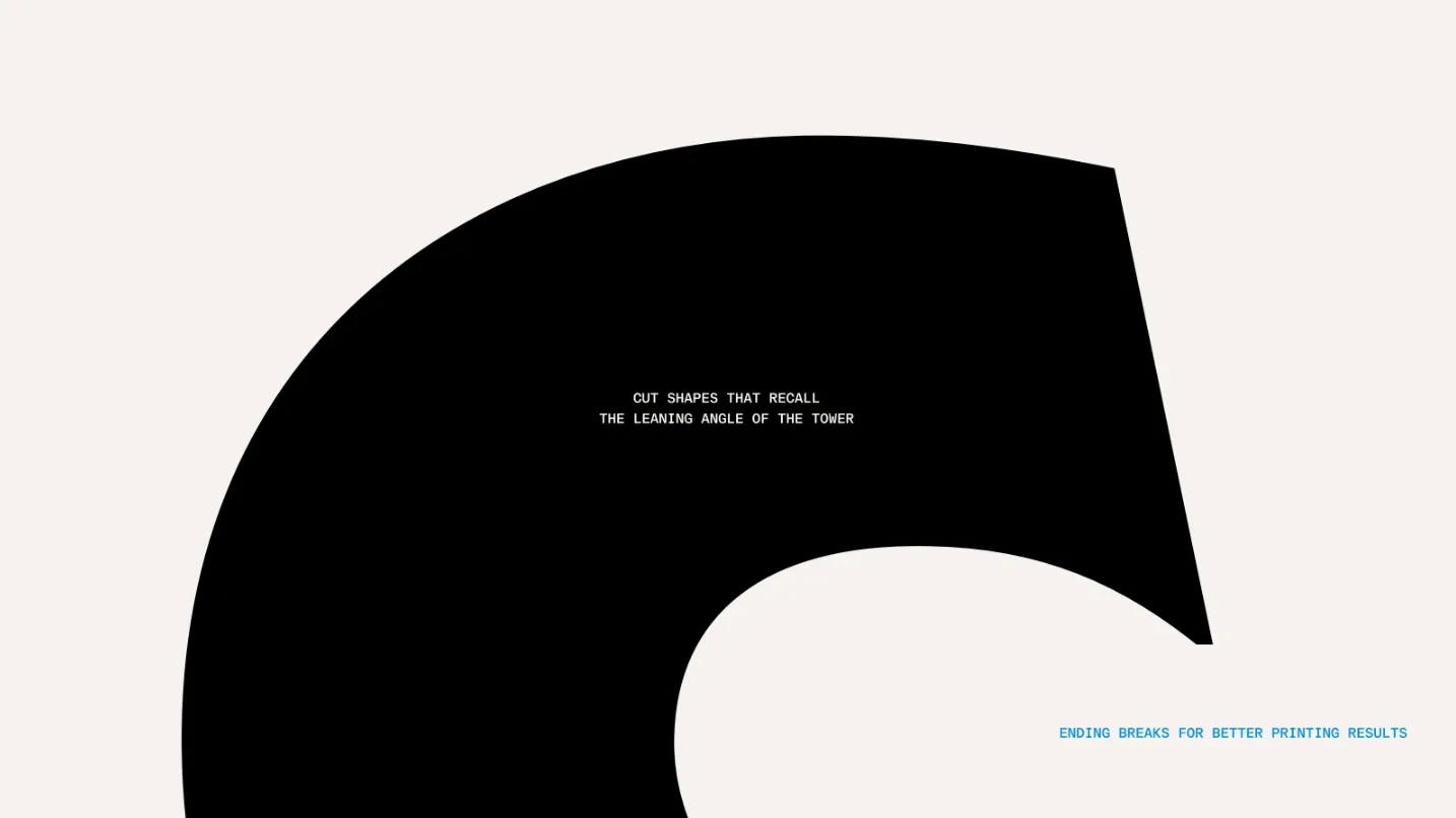
The custom typeface. The heart of the system is a typeface designed exclusively for the club, inspired by the architectural forms of Piazza dei Miracoli: flat tops that highlight the architectural qualities of the monuments, round counterforms that echo the rhythm of the arches, gentle serifs that recall the calligraphic heritage of the 11th and 12th centuries, and cut letterforms that reference the leaning angle of the Tower. A complete alphabet with ligatures and alternate letters, designed to give the club an unmistakable visual voice on every surface, from the jersey to social media.


The palette. Alongside the deep "Pitch Black" and the iconic blue of the Nerazzurri, the system reclaims the red of the city flag, the white of the marble of Piazza dei Miracoli, and a sunny yellow that captures the light of the city. These colors don't come from a mood board. They come from the city itself.
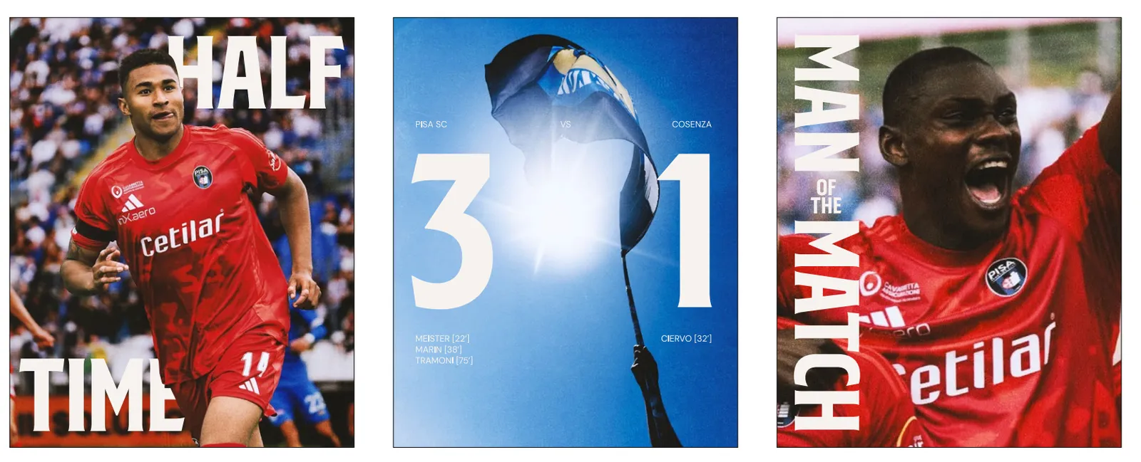
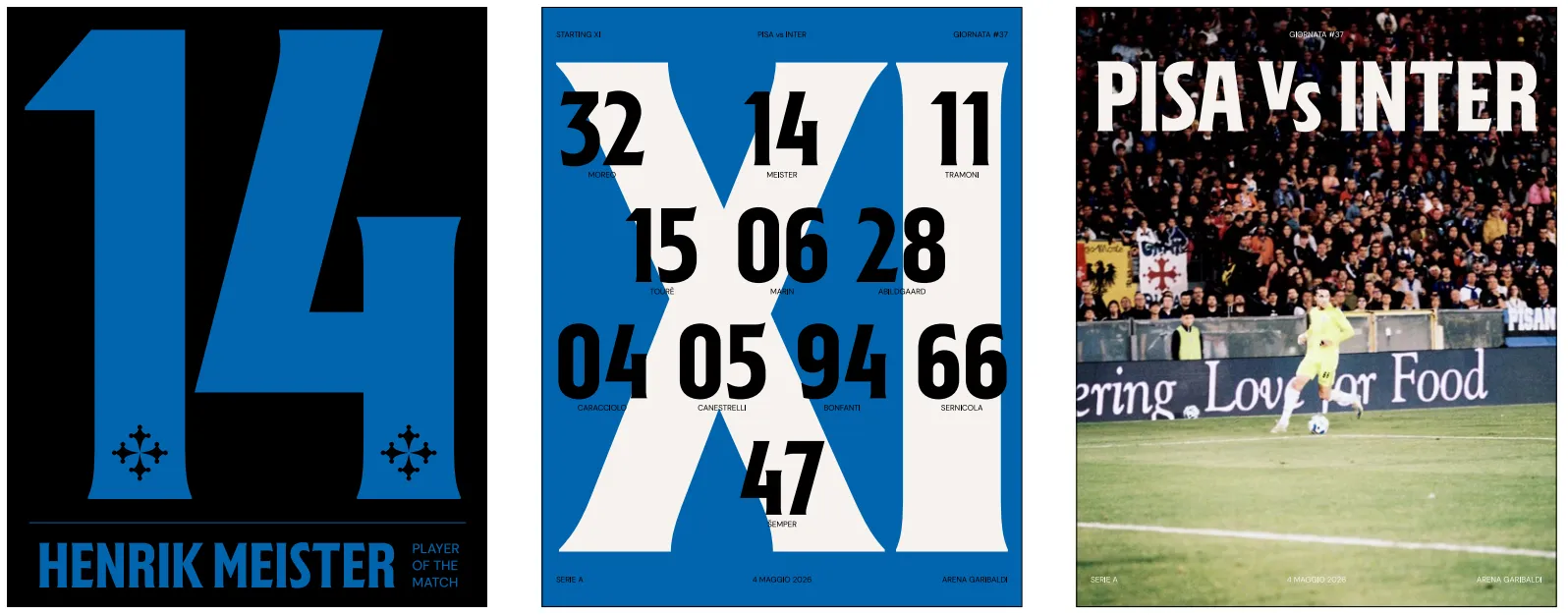
The system at work. On matchday, the identity becomes an editorial machine: starting lineups, halftime updates, final scores, and player of the match cards, all built from the same typeface, cross, and palette. Every post is instantly recognizable as Pisa, even before the crest appears.
What we didn't touch: the crest
One choice went against the grain: the club's crest, for now, stays the same. Instead of a revolution imposed from above, this is the start of a process that elevates the club's historical and visual heritage in a new way, involving the community step by step throughout the season. A redesign of the emblem may come, but only when the identity journey has matured.
It's a lesson that applies well beyond soccer: identity is not the logo. It's the system of symbols, stories, and behaviors that makes a brand recognizable and loved. Starting from research, rather than from a restyling, means building brand equity that outlasts every cycle, whether in sports or in the market. Like the Tower: it leans, but it doesn't fall.
- Field research beats any design trend: a brand's uniqueness already lives in its context. It needs to be discovered and systematized, not invented.
- A contemporary brand is a system, not a mark: it has to work as an editorial platform across formats and channels that never stop changing.
- The strongest identities are built with communities, not in spite of them, which is why the crest stayed untouched while everything around it evolved.
- A great claim reframes weakness as strength: "Defying gravity" turns the world's most famous architectural flaw into proof of resilience.